‘Jeopardy!’ Bosses Considering Big Change to How Show Looks

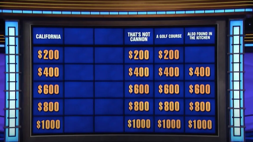
Jeopardy! producers Michael Davies and Sarah Foss are considering making a change to how categories are displayed on-screen, following a thread discussing the issue on the Jeopardy! Reddit forum.
Davies brought up the topic on Monday’s (February 13) edition of the Inside Jeopardy! podcast, noting, “In the era of 16:9 HD television, whether or not we should be putting the categories on screen when our clues appear.”
As it currently stands, the categories are listed at the top of the board, but once a contestant chooses a dollar value from a particular category, the clue pops up without the category listed anywhere on the screen.
“Because very often we don’t cut back to the wide shot of the board when players select; we don’t have time, the game is moving so fast,” Davies continued. “Clues pop out; people select them very fast; they often don’t say the whole name of the category. They’ll just say a dollar value as they’re going down the board.
“And even I, who sees the material before the show, who has a grid in front of me, I get lost in terms of what category we are in sometimes. And I know that’s part of it for the advanced Jeopardy! viewer; they have to remember the categories, remember where they are, and try and figure out where they are on the show.”
Referencing a Reddit thread on the topic, Davies wondered whether they “should find some screen real estate and whether we should put the category up every time a clue pops out. What do you all think about that?”
Foss agreed that “it’s good for text clues,” but it would “take away from the experience” for “videos, images, clips,” so it would need the hosts to reiterate the categories for those particular clues.
“We’re gonna take a look at it, we’re having our team dummy up what it would look like… we will then maybe look at testing it in an individual tournament, giving things a run out there in the real world, for the audience to be able to see them.”
Following the podcast, a Reddit user mocked up what it could look like to have the categories displayed above the clue.
“In this day and age, there’s plenty of real estate on the screen to put both the category and $$ amount,” wrote one fan. “Shrink the text if need be, but some of those clues could be shortened anyway, they’re getting wordy and long. We’re not watching jeopardy on 13 inch CRTs anymore!”
“This would def help at home. Categories like “Countries that start with N” and my dumb ass answers Bolivia. Then I’m like, Duh!” added another.
Another disagreed, writing, “I prefer playing it on the same level as the contestants. During the game, the clue screen doesn’t show the category, only the clue. This is why some contestants miss the questions themselves, answering way off the category, and why the host sometimes gently reminds them of the category. You have to be paying attention in order to answer correctly.”
What do you think about having the categories displayed above the clues? Let us know in the comments.
Jeopardy!, Weeknights, Check your local listings
From TV Guide Magazine
Crime, Comedy & Convenience Stores: Unwrapping Hulu's 'Deli Boys' With the Cast
Cupcakes, corndogs…and cocaine?! Two brothers find themselves in a hilarious pickle when they inherit an unseemly bodega biz in Hulu’s new comedy Deli Boys. Find out how The Sopranos and Real Housewives of Orange County influenced the cast. Read the story now on TV Insider.


