All 18 ‘Grey’s Anatomy’ Seasons Ranked by Their Posters
Grey's Anatomy posters
ABC

If you’ve ever seen a poster for Grey’s Anatomy at a subway station or a bus stop, you have graphic designers like the ones at BLT Communications to thank. (That creative agency designed every Grey’s poster from Season 1 to Season 14.)

Here in Season 18, though, we can admit that we’ve liked some of the posters more than others, and we’ve ranked them by effectiveness and appeal in the gallery above. Click through to see the key art, ordered from “How McDreamy!” to “Seriously?!”

Grey’s Anatomy, Thursdays, 9/8c, ABC

Season 14

Season 14

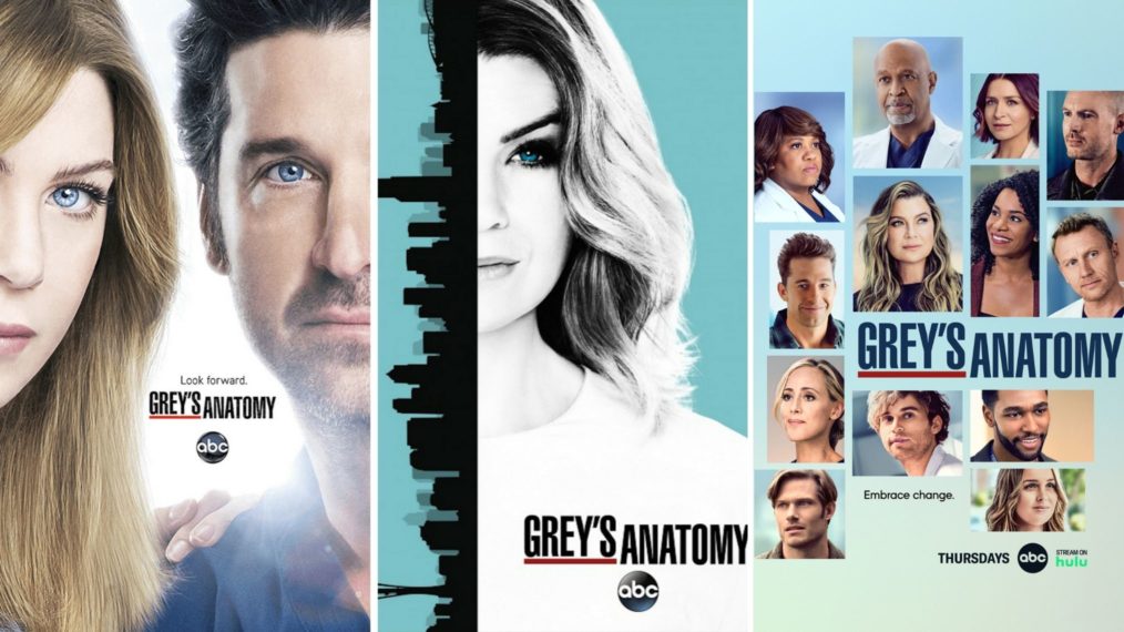
The asymmetrical stained-glass aesthetic is eye-catching, and Ellen Pompeo (Meredith Grey) gets a glossy close-up, but so too do her fellow original cast members: Justin Chambers (Alex Karev), Chandra Wilson (Miranda Bailey), and James Pickens Jr. (Richard Webber). It’s an attractive design, but more importantly, it’s a fitting tribute to the Grey’s stars who had been around the longest by Seaso.

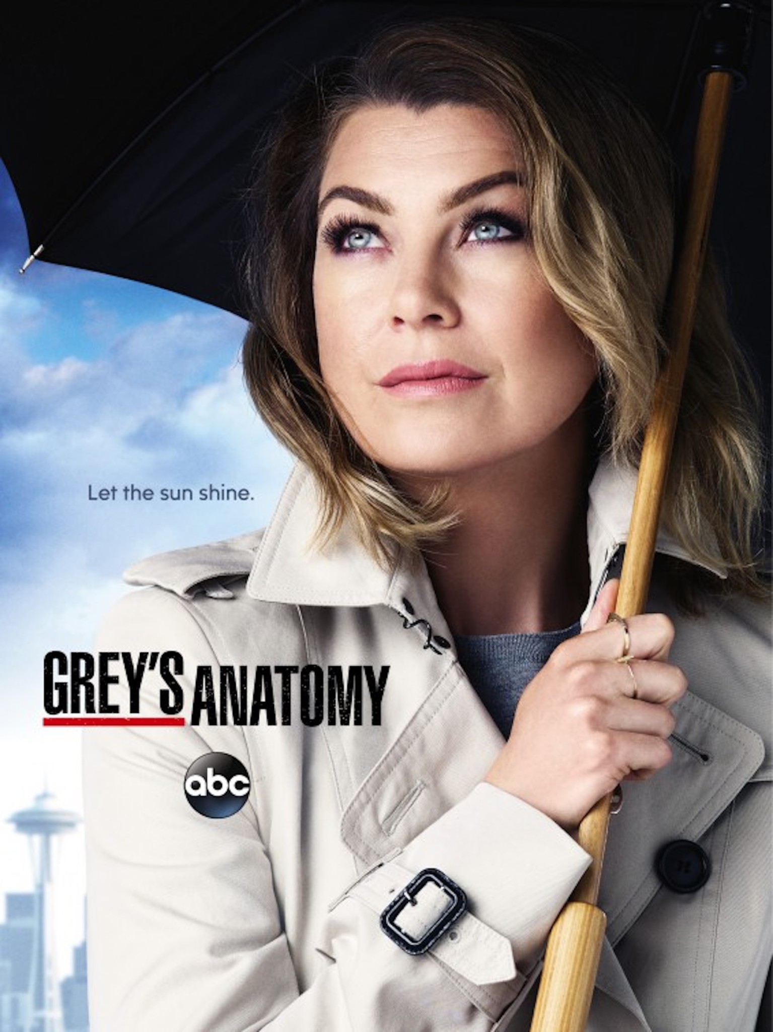
Season 12

Season 12

The perfect key art for the post-McDreamy era: A super-stylish Meredith emerging from the grief of the prior season and looking hella hopeful about the future. Here, the umbrella makes sense: The metaphorical rain is ending and the skies are clearing up. (Take note, Season 6 poster.)

Season 10

Season 10

One of the simplest posters is one of the best. No conspicuous airbrushing or Photoshopping, no collages or pastiches. Just a full-frame photo of three of the show’s leads rocking their navy attending scrubs and living their best lives. Plus, Sandra Oh (Cristina Yang) gets the foreground for her final season on the show.

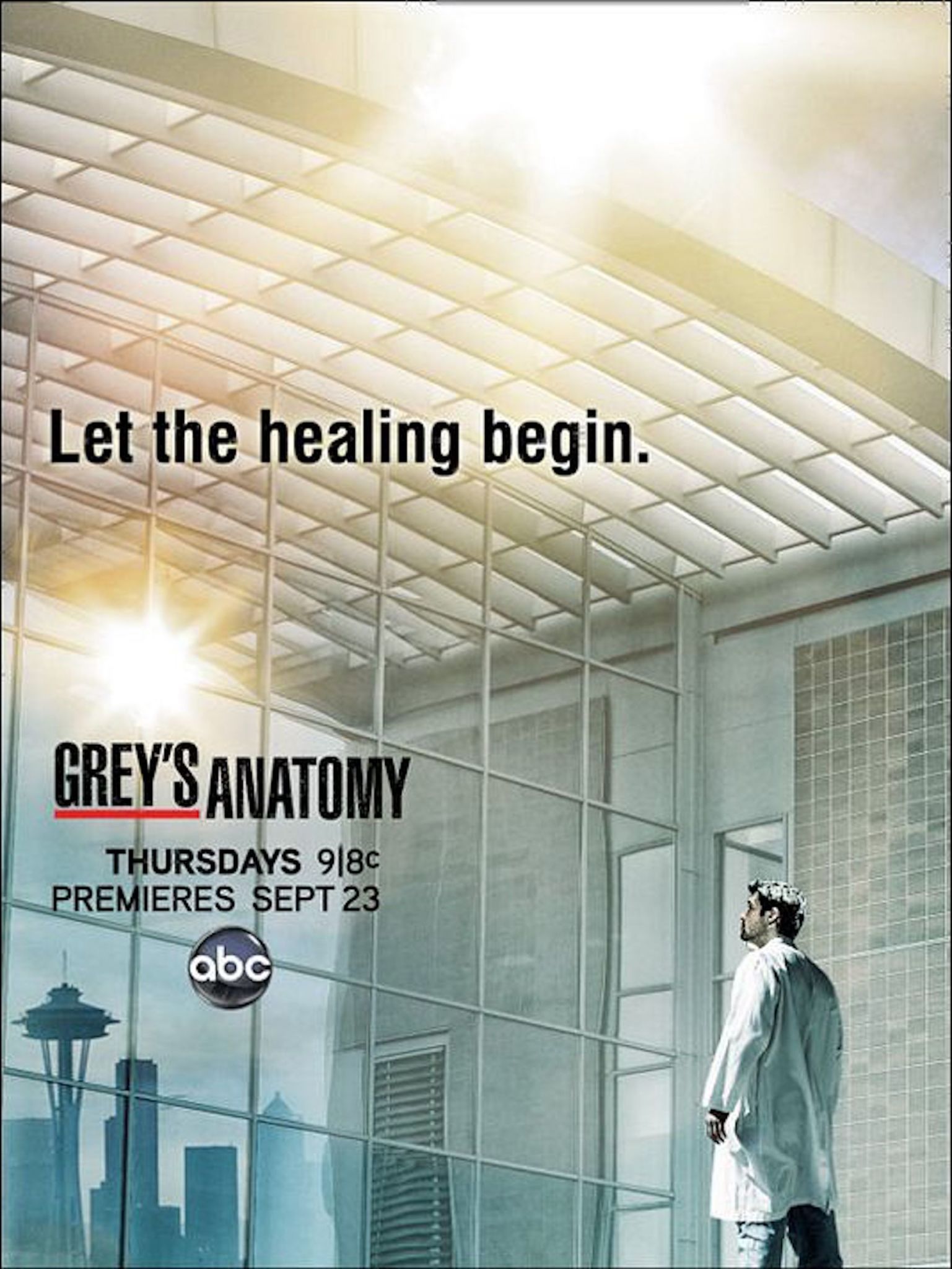
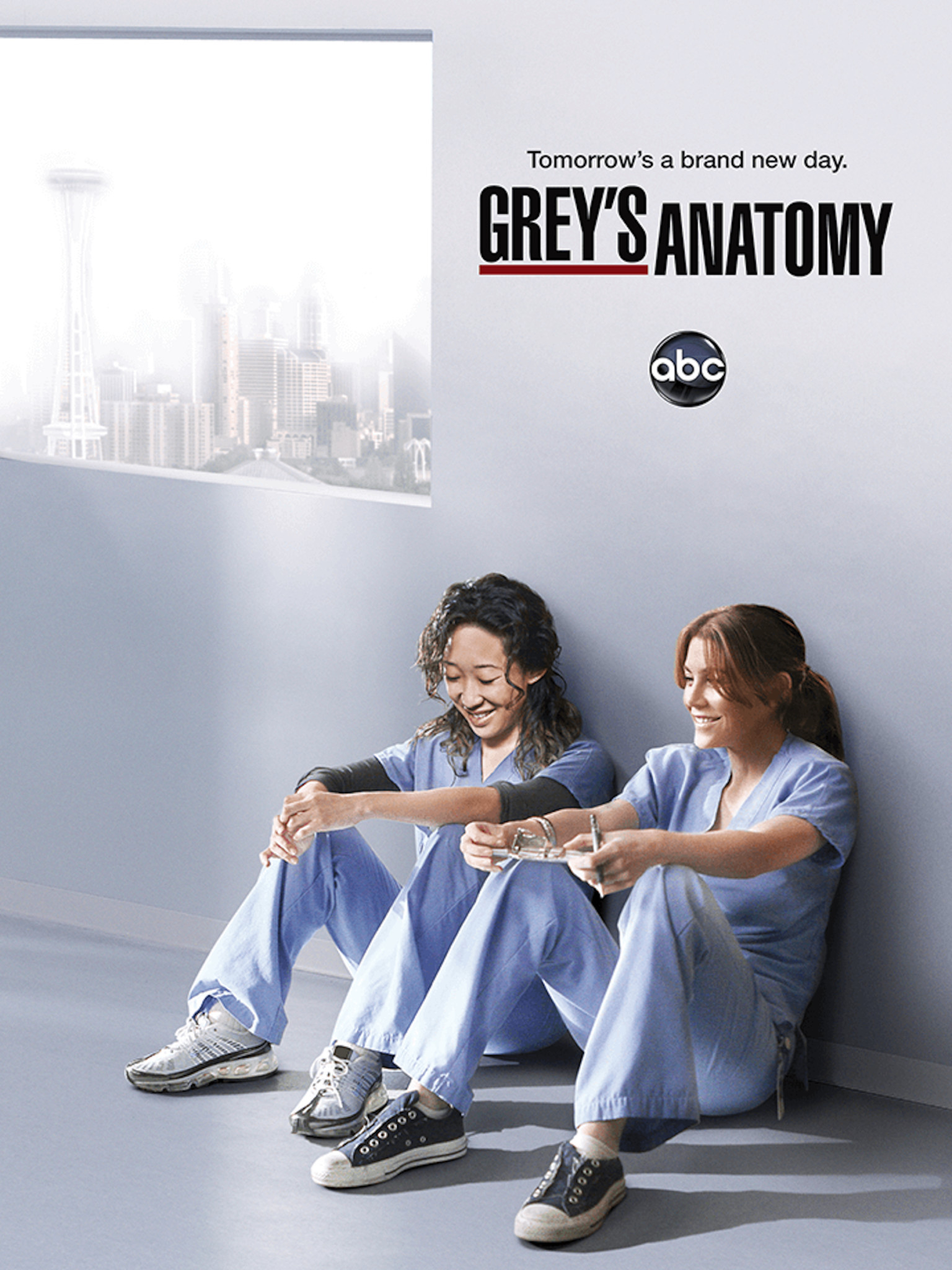
Season 7

Season 7

Never mind that the hospital atrium doesn’t actually have that view of Seattle… or any view of Seattle, really. This is still a beautifully rendered poster, one promising catharsis after Season 6’s deadly finale.

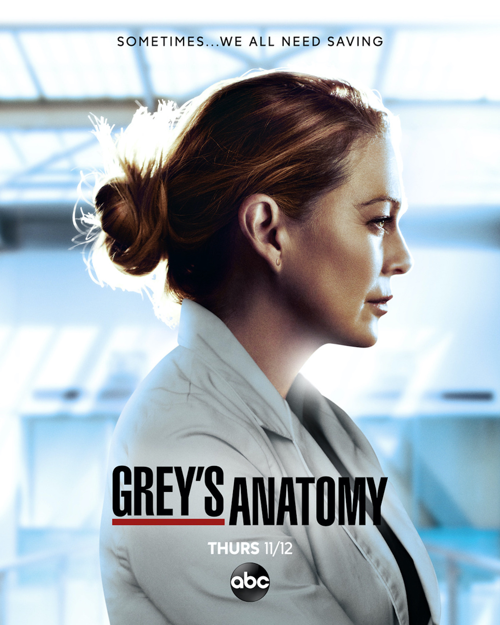
Season 18
ABC

Season 18

Sometimes less is more, especially when the three remaining Grey’s OGs of Season 18 get their heroic closeup. And those shades of blue sure are striking. But “A new tomorrow, today”? Sounds like more of a campaign promise than a Grey’s tagline.

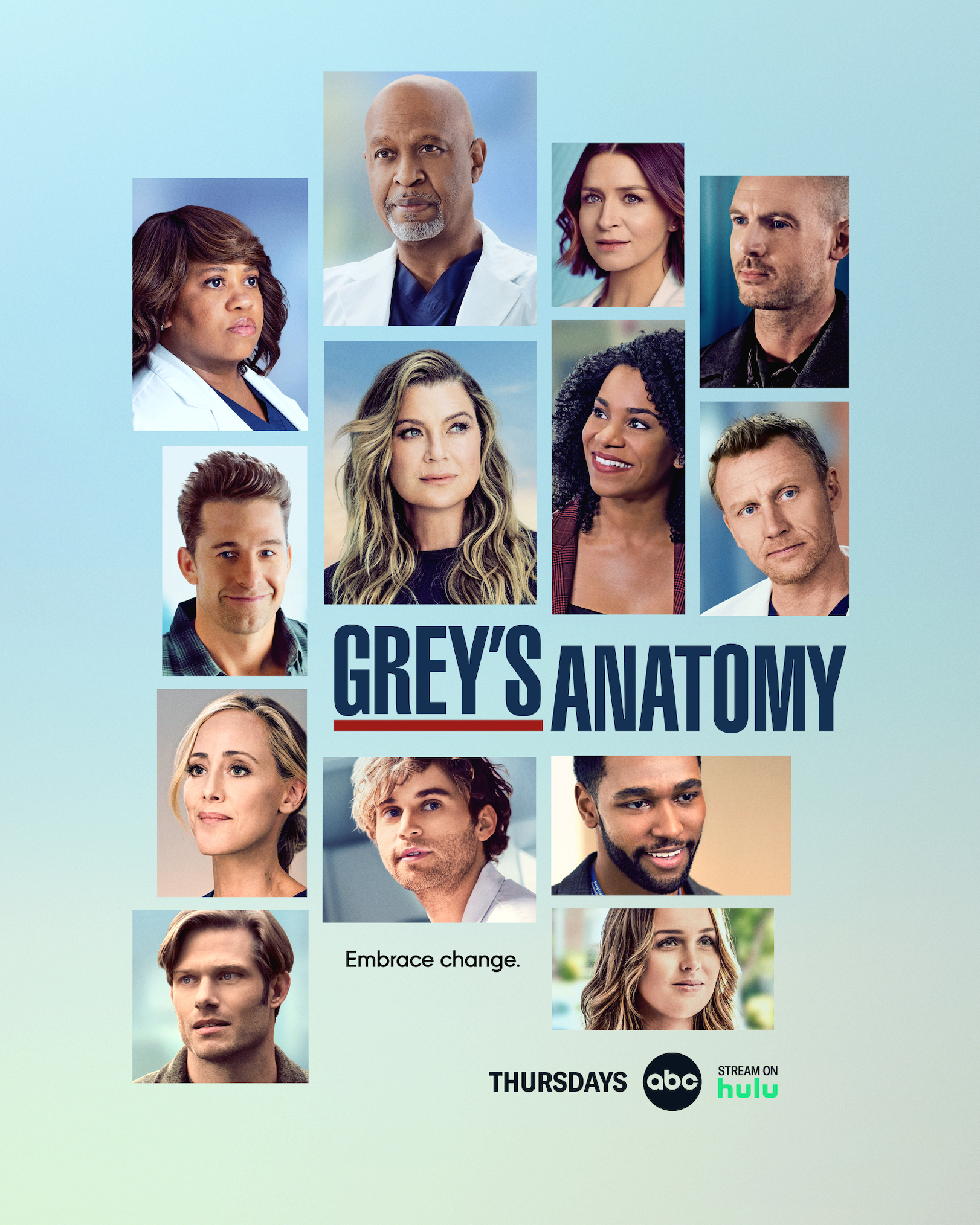
Season 18b
ABC

Season 18b

Two Grey’s posters for one season? How did we get so lucky? Even better, this one is our favorite of the collage-style posters. The pastel hues are bright and cheery, and the actors certainly look primetime-ready—or maybe just airbrushed!

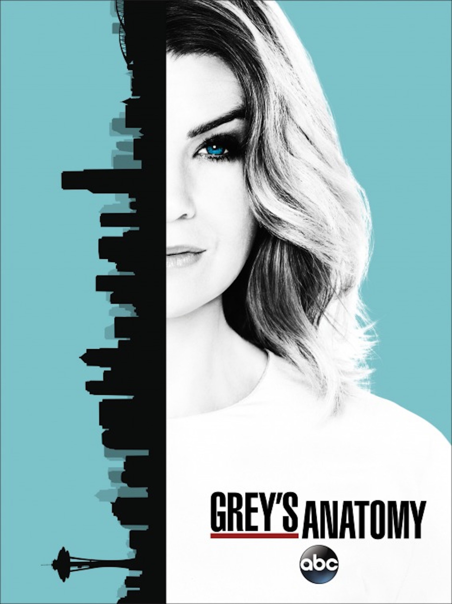
Season 13

Season 13

Sure, the graphic artists probably spent a lunch break putting this poster together, but the graphic is still eye-catching in a pop-art, Saul Bass-y way. We’re not mad at it.

Season 17
ABC

Season 17

Can we just say that Meredith is social-distancing from her colleagues in this one? But seriously, this poster for the COVID-19 season feels appropriate for the occasion. And knowing what we know now about Mer’s touch-and-go COVID battle, that tagline is apt.

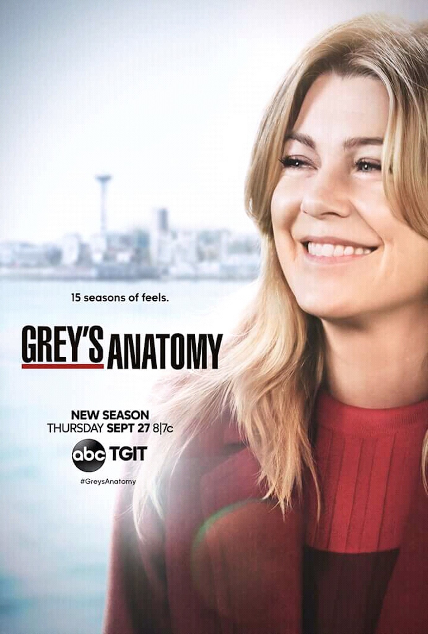
Season 15

Season 15

The third Meredith-only key art in the span of four years made us think of all the other cast members who had yet to see their faces on a Grey’s poster: Kevin McKidd (Owen Hunt), Camilla Luddington (Jo Wilson), and Jesse Williams (Jackson Avery), just to name a few. Plus, points off for recycling a photo—or, at least, an outfit—from the prior season.

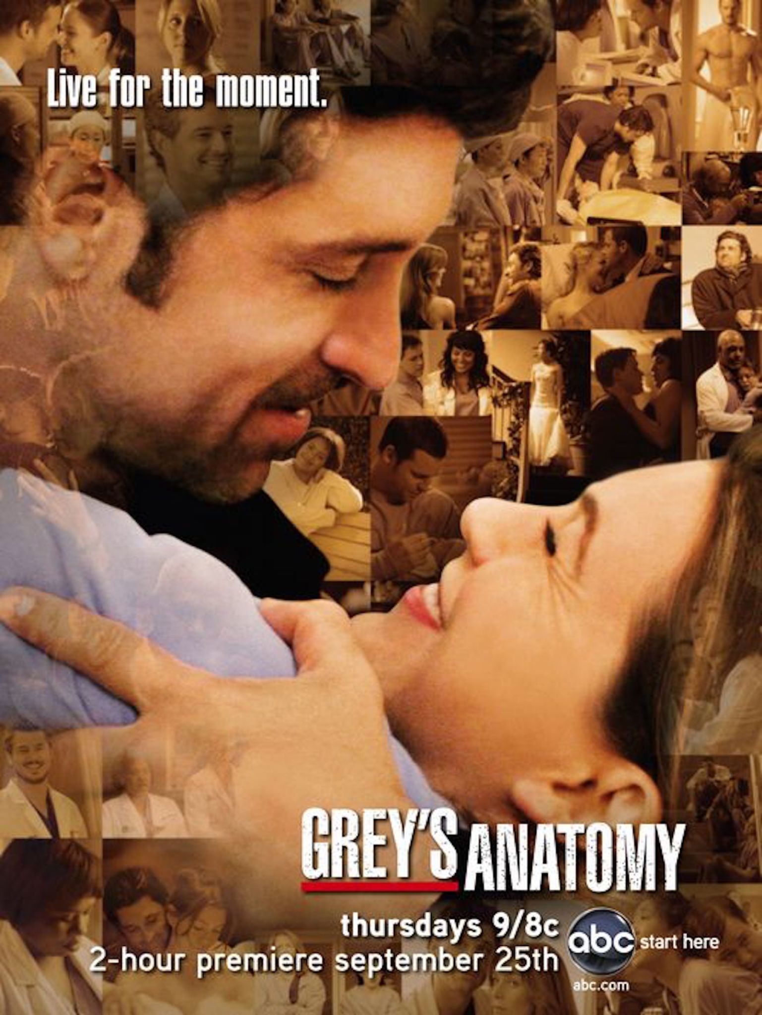
Season 5

Season 5

We wanna dislike this poster, but we’re not immune to its charms. McDreaminess aside, the “Live for the moment” tagline pairs well with the collage of iconic scenes from the show’s first four season. And we see you, nearly-naked Eric Dane (Mark Sloan).

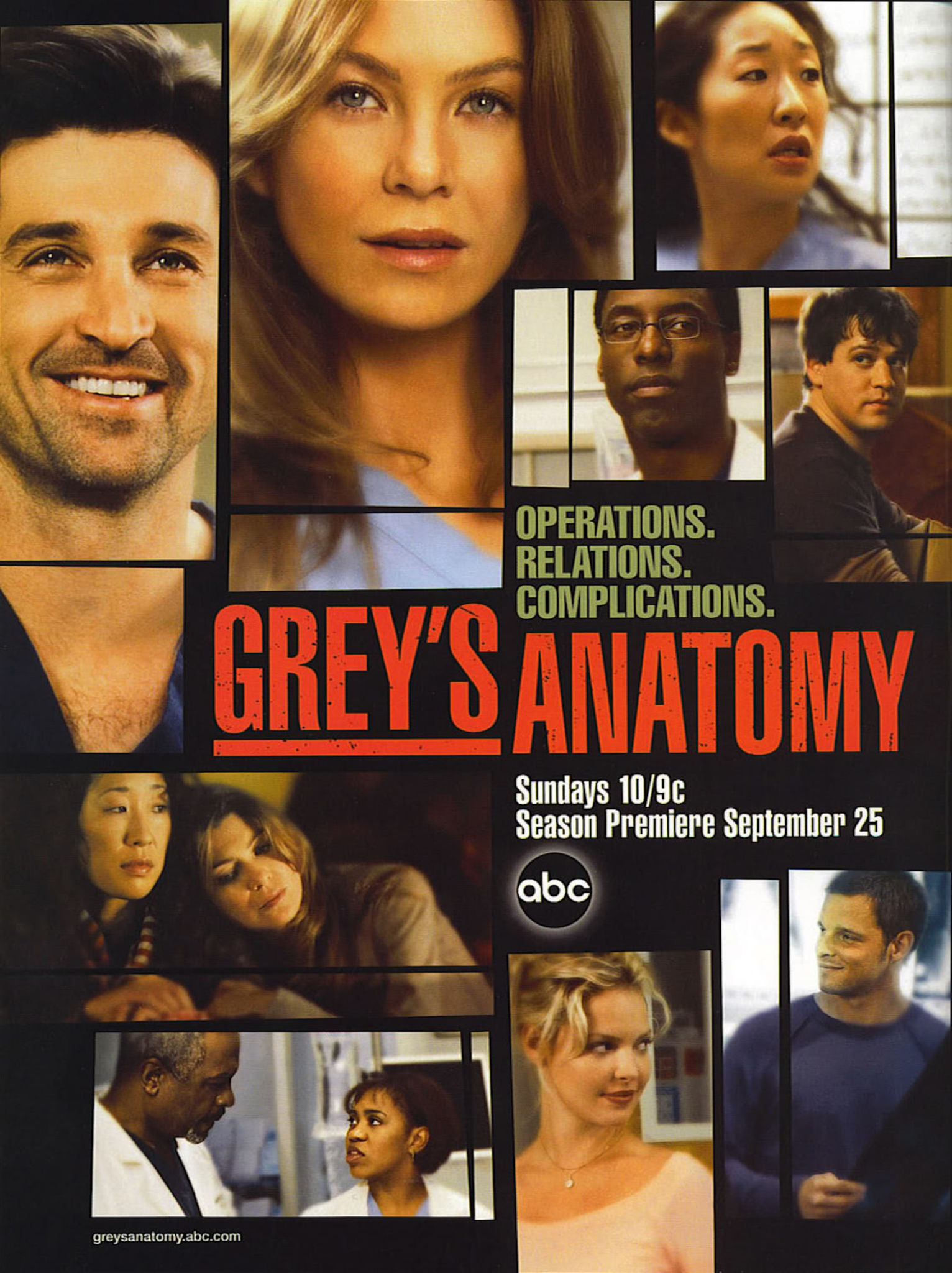
Season 2

Season 2

The second season’s poster is a retread of the Season 1 poster you see below, but at least the actors don’t look quite so FaceTuned this time around.

Season 16
ABC

Season 16

There’s nothing wrong with this poster. It’s just not particularly moving, Mer’s mid-stride stance notwithstanding. And that tagline—“Where do we go from here?”—didn’t exactly fill us with confidence. Not exactly what you want to hear from a surgeon… or a Grey’s writer!

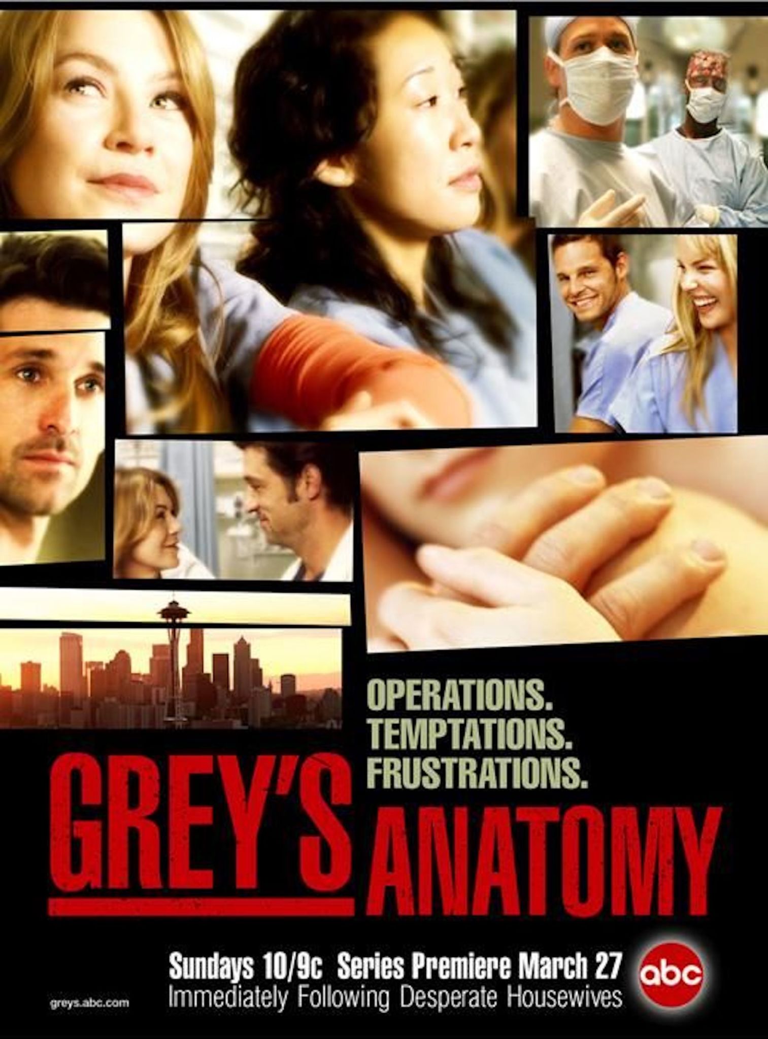
Season 1

Season 1

Really digging the off-kilter grid. Semi-digging the tagline. Not digging the hazy aura, a glow that almost screams, “It’s a medical show with heart!” (Also, y’all remember Desperate Housewives?)

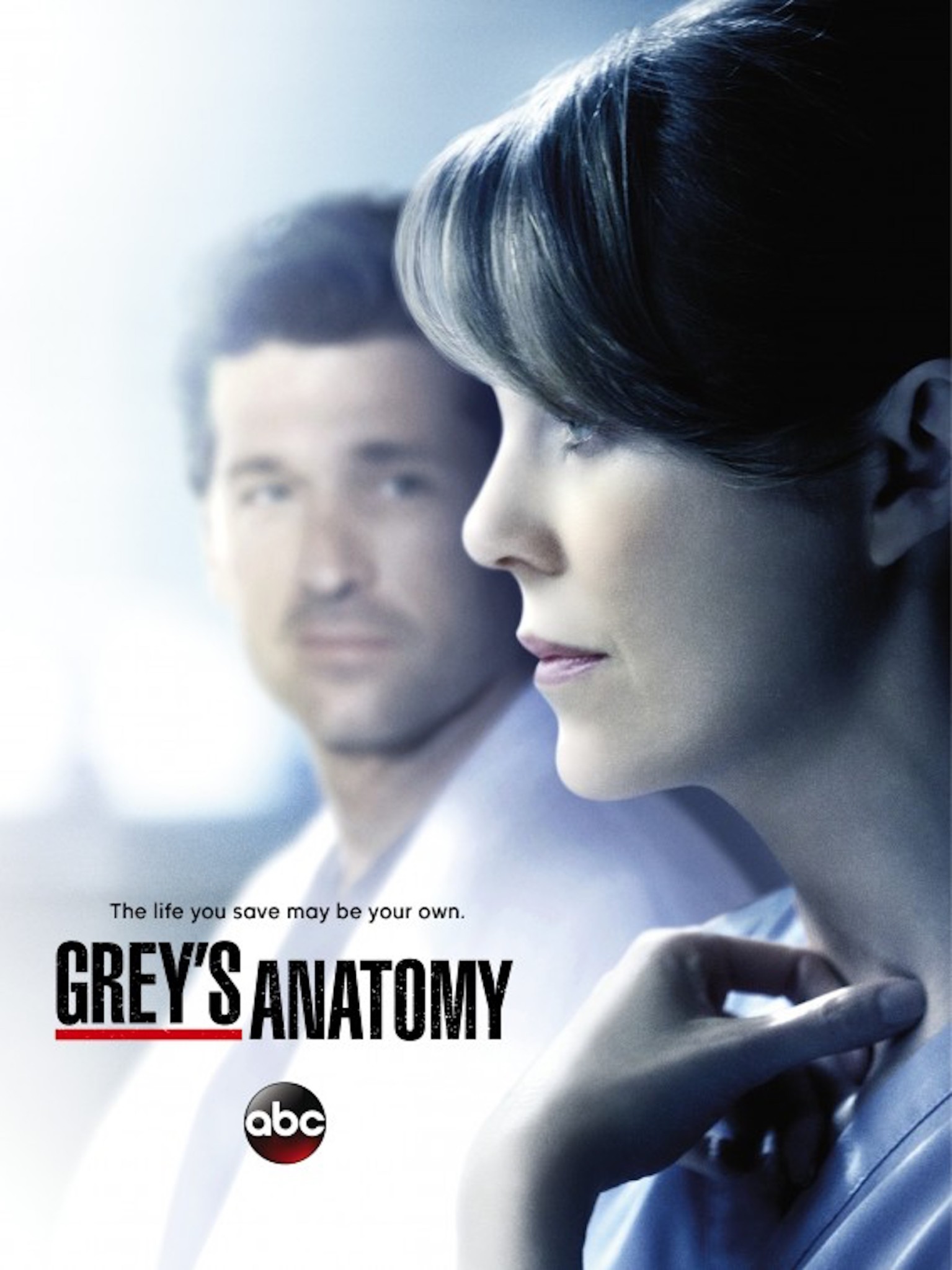
Season 11

Season 11

Too bad Derek (Patrick Dempsey) couldn’t save his own life, are we right? No, the tagline to this perfectly adequate poster probably relates more to Mer realizing she could live without Derek but didn’t want to. Unfortunately, she didn’t have a choice in the matter—and accordingly, the DVD version of this poster erases Derek’s face entirely.

Season 9

Season 9

Any poster in which you can discern each individual beard hair on Patrick Dempsey’s stubbly face can’t be all bad. But something about his spooked expression and Ellen Pompeo’s porcelain doll visage gives this poster an unnerving edge.

Season 8

Season 8

We’d live for a poster focusing on Cristina and Meredith’s “twisted sister” relationship, but this ain’t it. The characters’ heads seem to be pasted on other people’s bodies. It looks the graphic designers based the poster on this scene, but where are Meredith’s long sleeves? J’accuse!

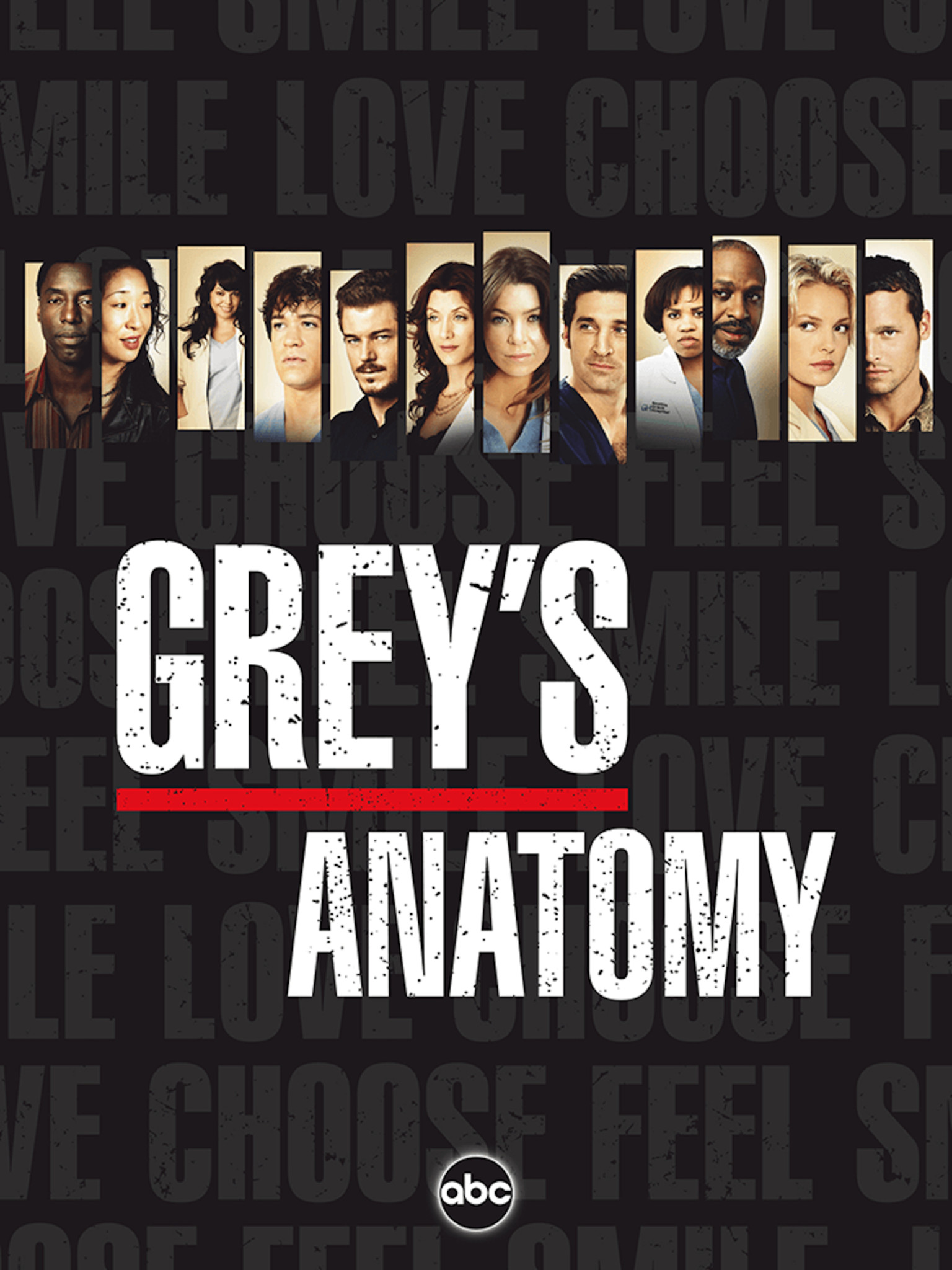
Season 3

Season 3

Don’t tell us what to do, poster! Even discounting all those imperatives in the background, this design is just uninspiring. And they did our Sara Ramirez (Callie Torres) dirty by making her that small!

Season 4

Season 4

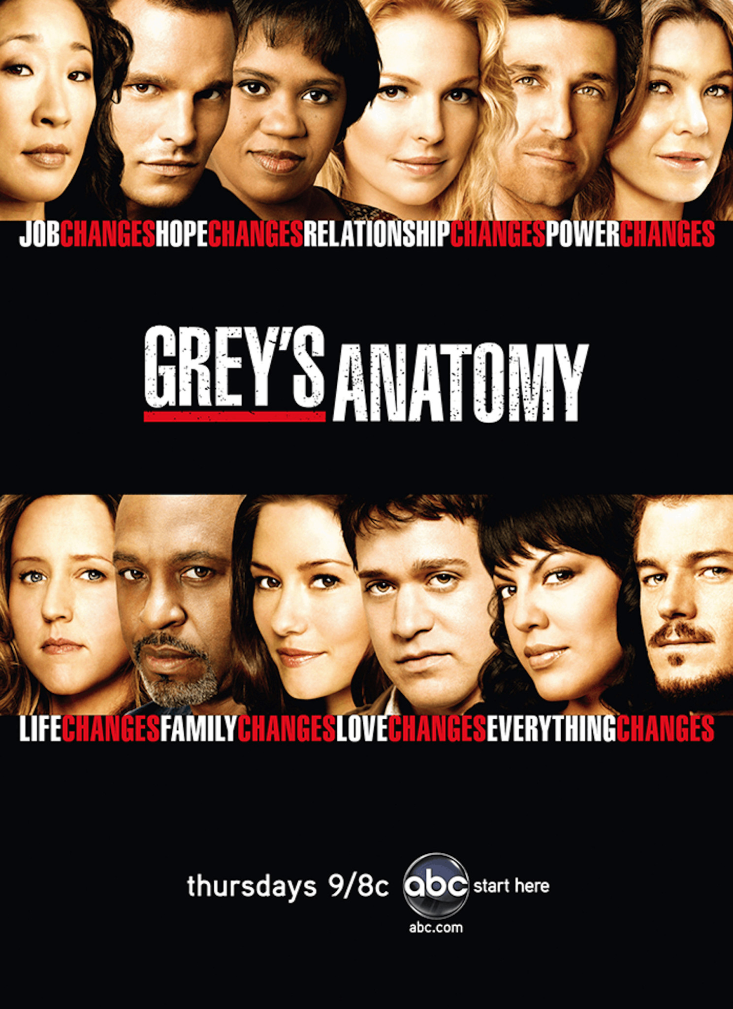
Say, Grey’s Anatomy, could you spare some change? Not only are all the stars’ faces smushed together in this hodgepodge, but the irises of their eyes are also weirdly lightened. It must have been a trend of the mid-2000s.

GA_SinglePage_2009.indd

Season 6

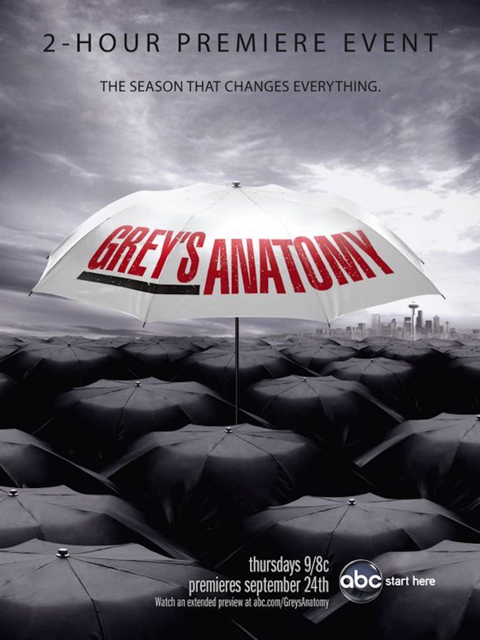
Honestly, the season that “changes everything” didn’t really change much of anything, for our money. And that umbrella motif makes sense in the context of rainy Seattle but doesn’t say much else about the show. Season 13 did the umbrella thing so much better.